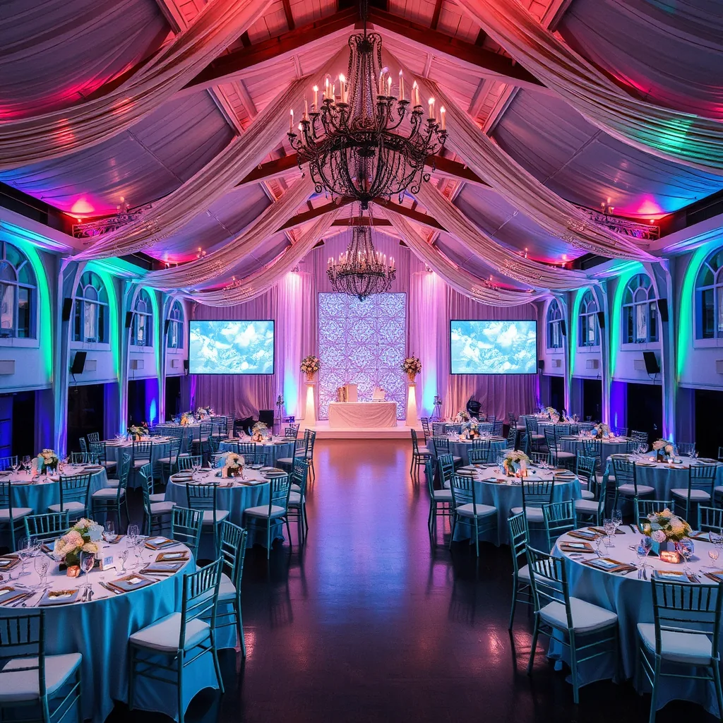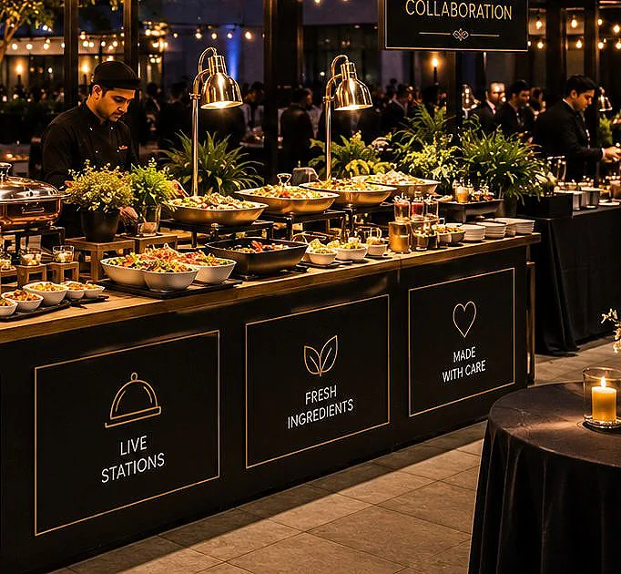
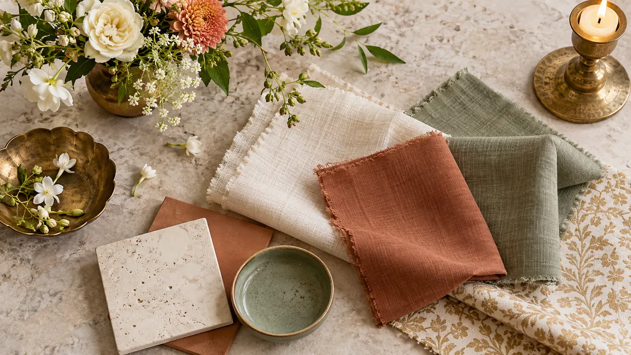
An event colour palette works best when it expresses the mood of the occasion. A quiet dinner, a lively celebration and a brand gathering may each call for a different balance of colours. Start with the atmosphere you want, then consider the venue’s existing materials and finishes. This helps the design feel connected to the space rather than placed on top of it.
Build a balanced visual language.
Choose a main colour, a supporting tone and an accent, then explore how they work across linens, flowers, signage and lighting. Materials can change how a colour feels: the same tone may appear softer in fabric and sharper on a glossy surface. Review samples together where possible, and check them under lighting similar to the event setting.
Let the palette support the experience.
Use stronger accents to guide attention toward key areas and quieter tones where guests will sit or talk. For event design in Pune, a consistent palette can bring different suppliers’ contributions together without requiring every element to match exactly. The goal is harmony, with enough variation to keep the setting interesting.